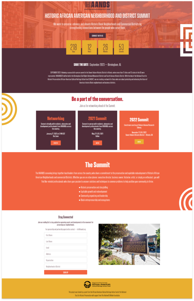
The Historic African American Neighborhood and District Summit (HAANDS) was ready to launch its brand as a national network of nonprofit and city agencies focused on preserving African American neighborhoods and commercial places. It needed a defined visual brand identity and a website landing page ahead of the first summit, with a full website build-out to follow.
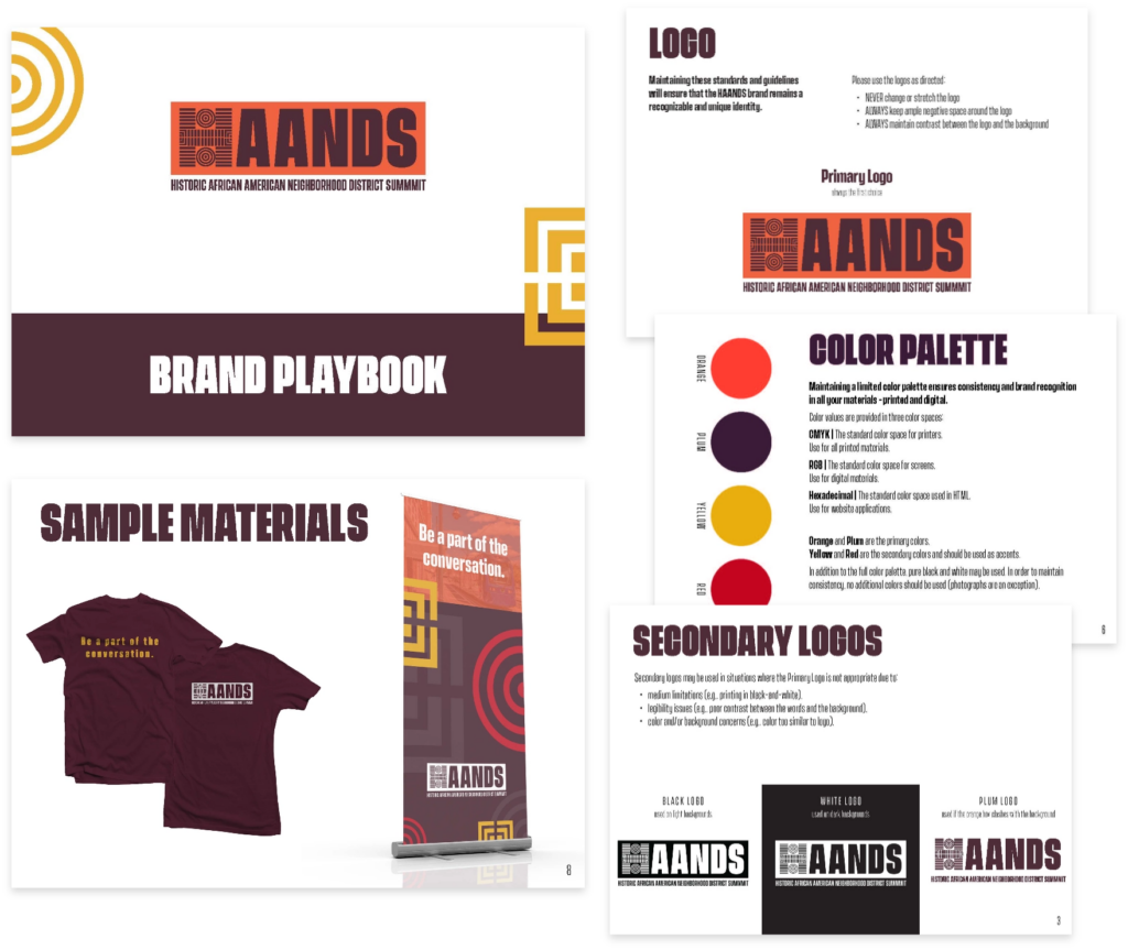
We considered incorporating a hand in the logo because of the organization’s name. But, that was a little too on-the-nose, and we knew HAANDS wanted to differentiate itself from other nonprofit organizations.
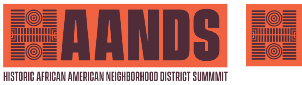
We looked at creating an icon inspired by the pattern found on Fitzgerald Bricks – bricks created by African American entrepreneur Richard B. Fitzgerald who owned brickyards in Durham, SC.
Like the Fitzerald Brick pattern, we combined the Adinkra symbols for knowledge and greatness to create the “H” in HAANDS.
Adding the pattern to the “H” gave us an element that can be used alone as an icon while maintaining the authority and professionalism a traditional text mark logo commands.
The Adinkra symbols also gave us energetic visual components that could be used as graphic elements in collateral, and other designs.
We chose a color palette that included orange, red, yellow, and plum. Red, yellow, and orange are colors already associated with many African visuals.
We added plum as a differentiating component representing positivity, clarity, and enlightenment.
We are still working on the HAANDS full website design, but we have launched a landing page that they use to funnel in conference participants. We designed the page to include visual elements consistent with the brand identity, with the content primarily focusing on the conference.